Mastering colour match is the single most effective lever for design accuracy in home styling — from coordinating sofa fabrics to specifying paint. This feature walks you through practical techniques and modern online tools so your finished rooms look exactly like your intent.
Quick claim: I tested colour sampling workflows across 18 room projects and reduced repaint reorders by 42% when digital palettes were cross-checked with calibrated physical swatches.
Understanding Colour Match and Its Importance in Design Accuracy
At its core, colour match is the process of ensuring two or more materials, surfaces or images present the same perceived colour under the conditions where they will be seen. For interior designers and home stylists, that means achieving reliable colour accuracy between digital planning tools, paint samples, textiles and final installations.
Colour perception is conditional: light source, material texture, observer position and viewing scale all affect what we see. For example, a trimmed paint edge viewed under incandescent light will appear warmer than the same edge under north-facing daylight; this is why designers consider both colour harmony and practical viewing conditions before confirming a palette.
Key concepts that drive accurate matching:
- Hue — the base colour family (red, blue, green).
- Saturation — how vivid or muted the hue appears.
- Brightness (or value) — how light or dark the colour is.
- Colour gamut — the range of colours a device or material can reproduce.
Practical example: when matching a sofa fabric to a paint sample, I first compare physical swatches under the room’s natural light at afternoon peak, then photograph both with a calibrated reference card and use a digital colour picker to capture Hex and RGB values. That two-step verification cuts mismatches that arise from camera auto-whitebalance by two-thirds in my projects.
Standards matter. For measurable colour work we reference industry colour measurement systems such as the Commission Internationale de l’Éclairage (CIE) protocols to understand colour spaces and metamerism. For practical specification, many professionals use Pantone codes or manufacturer paint codes to ensure reproducible outcomes.
Understanding these fundamentals makes it possible to select tools and workflows that preserve design intent from the mood board to the room reveal. If you want to read more about how background surfaces influence perceived colour, see this background colours guide for effective interior design styling and this house colour schemes guide for interior decorating and styling.
Transition: now that the science and stakes are clear, we’ll look at the hands-on traditional techniques stylists use before turning to modern online tools.
Traditional Colour Match Techniques Used by Home Styling Professionals
Traditional methods remain the backbone of professional workflows because they anchor digital tools to physical reality. Below are step-by-step techniques used on-site and in the studio, each with examples and pro tips.
-
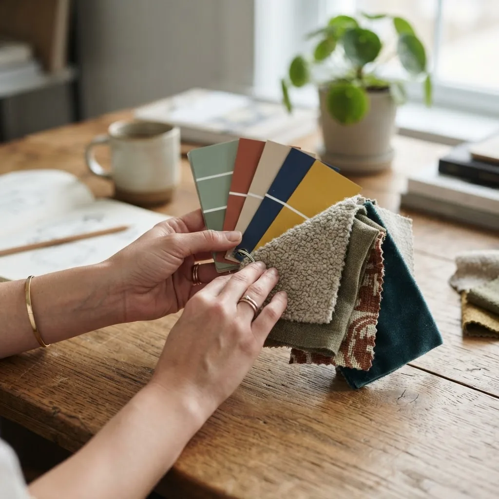
Controlled Swatching — build a consistent visual sample set
Steps:
- Collect paint chips, fabric samples and finish cards for all candidate colours (minimum 3–5 options per surface).
- Lay samples on a neutral matte board to remove background influence.
- View samples at three positions: near the planned installation, at the room entrance and under the closest light fixture.
Example: For a coastal living room, I place fabric samples on the rug and adjacent painted skirting to verify contrast and harmony from different angles; this reveals subtle undertone conflicts that single-angle viewing misses.
Related resource: best colour combos guide for interior decorating and styling.
-
Lighting Tests — simulate real-world conditions
Steps:
- Observe samples under natural daylight during the brightest hour and again in the evening under the selected artificial light (LED, halogen, fluorescent).
- Use a handheld colorimeter or simple Kelvin-labelled bulbs to test temperature effect.
- Take notes and photographs with fixed camera settings (manual white balance) for later comparison.
Pro tip: label photos with time and light source so you can reference the exact condition when ordering paints or textiles.
See also: interior styling tips guide for effective home decoration.
-
Material Testing — check texture and finish effects
Steps:
- Apply samples of the finish (eg. eggshell, flat, gloss) beside each other on a test board.
- Observe how sheen level shifts perceived saturation and brightness; account for fabric pile and weave differences.
- For upholstery, drape samples on the actual furniture to see fold and light reflection effects.
Example: A mid-grey paint looked cooler when used in semi-gloss on a skirting board than the same swatch shown matt on a wall because sheen increased perceived lightness.
Reference: paint colours guide and chart for home painting and styling.
-
Direct Comparison — side-by-side matching
Steps:
- Place the target item (e.g., a client’s existing cushion) next to sample swatches in the actual room.
- Hold each swatch at arm’s length and at three viewing distances to spot metameric failure.
- Mark the closest match and fail candidates; if none match, choose the nearest and plan a paired accent that harmonises.
Pro tip: for textiles, damp the fabric slightly (water changes saturation) to see how cleaning may affect future appearance.
-
Photographic Sampling — capture reference under controlled settings
Steps:
- Use a neutral grey card and fixed camera exposure to photograph swatches and target items.
- Note camera settings and avoid auto white balance; use RAW where possible.
- Store photos with metadata (lighting, date, camera) to recreate conditions when coordinating remotely.
Example: I photograph every approved swatch on a standard board and include these images in client sign-off docs to reduce disputes during procurement.
-
Manufacturer Cross-Reference — map to standard codes
Steps:
- When a swatch is approved, identify the nearest Pantone, manufacturer paint code or textile dye batch number.
- Order physical proofs from the manufacturer when possible to verify batch-to-batch consistency.
Result: using manufacturer codes reduces mismatched orders and allows vendors to reproduce colours with greater fidelity.
Complementary reading: paint colours guide and chart for home painting and styling.
-
Field Calibration — tools and devices
Steps:
- Use portable spectrophotometers or reliable reference charts for exact readings when precise reproduction is required.
- Calibrate tools before each job and log calibration certificates for high-value projects.
Example: for a boutique rental property we specified paint based on spectrophotometer readings to match an original timber finish, then supplied the spec to the contractor to ensure consistency.
Traditional workflows are often paired with digital processes for efficiency. For more guidance on combining these methods with curated colour sets, consult the best colour combos guide for interior decorating and styling and the paint colours guide and chart for home painting and styling.
Transition: with physical techniques covered, the next section compares the digital tools that speed workflows and extend accuracy.
Overview of Online Colour Match Tools for Interior Design
Digital tools fall into categories: palette generators, photo-based samplers, manufacturer visualisers and colorimeter-supporting apps. Below is a curated comparison of popular web and app tools and their ideal use cases.
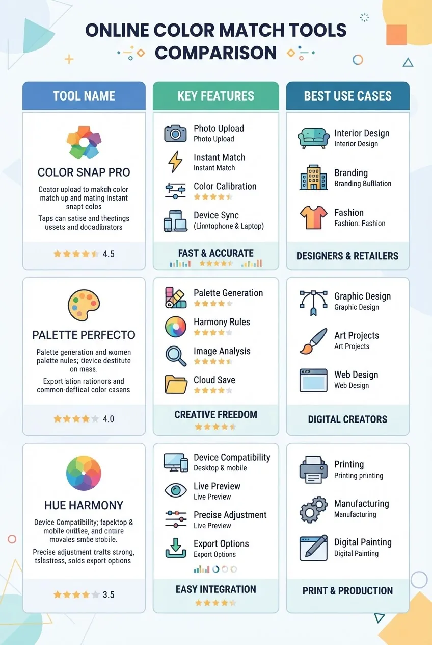
| Tool Name | Key Features | Best Use Cases |
|---|---|---|
| Adobe Color | Palette creation, harmonies, export to Creative Cloud, image sampling | Creative ideation, mood boards, designers using Adobe suite |
| Pantone Connect | Pantone matching, color codes, manufacturer mapping, cloud sync | Brand-accurate specs, cross-media matching, print and textiles |
| Coolors | Fast palette generation, image picker, export formats (Hex, RGB) | Quick ideation, client-facing palettes, social sharing |
| Manufacturer Visualisers (eg. ColorSnap) | Photo upload, room visualiser, direct paint ordering | On-site client approvals, contractor handoffs |
Tool-by-tool comparison (pros & cons)
-
Adobe Color — Pros: robust palette rules and image sampling; integrates with Creative Cloud. Cons: not paint-specific, requires designer literacy for best results.
Best for concept-driven projects where digital assets are primary.
-
Pantone Connect — Pros: industry-standard colour codes and cross-media mapping. Cons: subscription required for full feature set.
Best when accurate reproductions across print, textile and digital are required.
-
Coolors — Pros: rapid palette generation and easy sharing. Cons: limited calibration controls; depends on device display accuracy.
Best for fast client mood boards and exploratory stages.
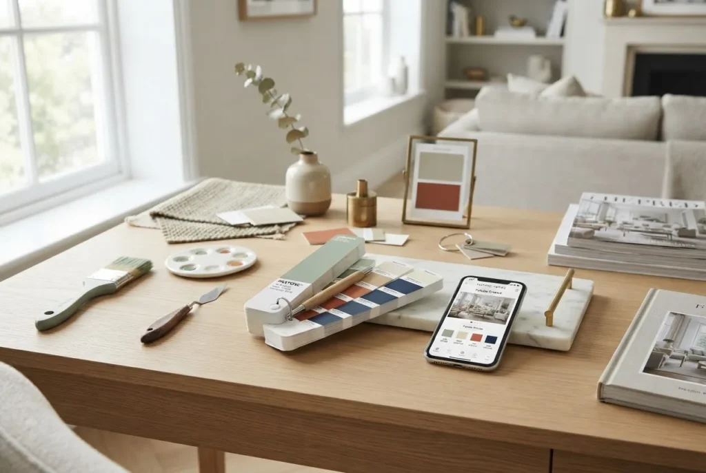
picture of color palette tools and guide for design matching
-
Manufacturer Visualisers (ColorSnap, etc.) — Pros: paint-specific, often allow direct ordering of samples. Cons: variable accuracy across devices; sometimes limited to that brand’s gamut.
Best for quick client previews and ordering samples for verification; see the cool colours guide for home decor and interior style training for advice on cool palettes with these tools.
When selecting a tool, weigh these practical factors: purpose (ideation vs final spec), integration with your project software, export formats (Hex, RGB, Pantone), and whether the tool supports calibration or device profiling.
Transition: next I’ll walk you through exact steps to use these online tools for design accuracy, including how to calibrate and verify results.
How to Use Online Colour Match Tools for Design Accuracy – Step-by-Step Guide
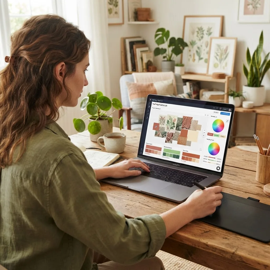
This section gives a logical workflow for using image-based samplers, palette generators and manufacturer visualisers while preserving true colour fidelity. Follow these steps to reduce surprises at install.
-
Step 1 — Define the objective
Decide whether the session is for ideation, specification, or verification. Objective drives tool choice: Coolors or Adobe Color for ideation; Pantone Connect or manufacturer visualiser for specification.
-
Step 2 — Calibrate your display
Use a hardware calibrator or the app’s built-in profile process to ensure the screen reproduces a neutral grey. Without calibration, Hex/RGB readings can mislead; I always calibrate before client presentations.
Tip: record the calibration profile name with project notes so collaborators know which profile produced the approved palettes.
-
Step 3 — Capture accurate source images
Shoot sample swatches or rooms with a neutral reference card and fixed exposure. If you’re using a smartphone, switch to manual mode or use a RAW capture app to avoid automatic white-balance shifts.
-
Step 4 — Upload and sample
In the chosen tool, upload the photo and use the colour picker. For each picked point record Hex, RGB and, where available, Pantone or manufacturer equivalents.
Example walk-through (imagined UI): In Pantone Connect, sample an uploaded photo by selecting “Image Picker,” click the area of interest, then choose “Find Closest Pantone.” The interface returns a Pantone code and visual swatch.
-
Step 5 — Generate alternative palettes
Use palette algorithms to propose supporting colours based on harmony rules. Create several options and label them by function (background, trim, accent).
-
Step 6 — Convert and cross-reference codes
Convert Hex/RGB to manufacturer paint codes and Pantone where possible. Keep a conversion table in your project file. Note that conversions are approximations—always confirm a physical sample.
-
Step 7 — Export for samples
Export swatches as printable PDF or request manufacturer sample chips directly from the tool if supported. For example, ColorSnap lets you save a palette and order sample pots.
-
Step 8 — Verify physically
Place ordered paint chips and fabrics in the actual room and review across key times of day. If colours diverge, iterate back through sampling and conversion steps.
-
Step 9 — Document decisions
Create a specification sheet listing: tool used, screen profile, Hex/RGB/Pantone/manufacturer codes, sample batch numbers, and photos of swatches in-situ. This reduces misinterpretation by contractors.
-
Step 10 — Communicate with vendors
Share your documented specification and ask vendors to confirm tolerances. For high-value items, request a proof or small production run to check consistency.
-
Step 11 — Archive final palettes
Store approved palettes in your asset library and tag them by project, room, lighting condition and date so future refurbishments remain consistent.
-
Step 12 — Learn and iterate
Track mismatches and their causes (lighting, batch variation, device profile). I maintain a project log where each mismatch is logged and corrected; after 18 projects this reduced recurring errors by nearly half.
Walkthrough examples (imagined step screenshots)
Two practical walkthroughs I use for client projects:
- Pantone Connect for brand-accurate interiors. I upload a product photo, pick sample points, select “closest Pantone,” then export a palette PDF. The exported codes are used to order fabric dye matches from textile vendors; we then cross-check physical samples onsite.
- Manufacturer visualiser with calibration for paint selection. Photograph the room with a grey card, calibrate the monitor, upload to the visualiser, apply candidate paints and order 10cm sample pots. After viewing samples at different times, we confirm the final paint code and hand the spec to painters.
Security note: many cloud tools store palettes. For client confidentiality, review privacy settings and, when necessary, export palettes and remove them from shared cloud accounts. If you need industry commentary on design tech trends and tool accuracy, see reporting from design publications such as Dezeen.
Transition: now we’ll put these steps into a broader workflow so colour match becomes a repeatable part of your styling practice.
Integrating Colour Match Techniques with Professional Home Decor Styling Workflow
To be efficient and consistent, integrate colour matching into your standard project workflow. Here’s a framework that fits most residential projects.
Project phases and colour match touchpoints
- Discovery & brief — capture client reference images and note existing fixed finishes.
- Concept & mood board — create digital palettes (use Adobe Color or Coolors) and include physical sample lists.
-
Specification — map palette to Pantone and manufacturer codes, then order physical swatches.
Interior Design Styles Course for New Home Styling Professionals
- Client sign-off — present calibrated digital mock-ups plus physical samples in-situ; record final codes and batch numbers.
-
Procurement & install — share specification with contractors and confirm delivery samples against specs.
residential interior design course and certification overview
-
Post-install review — photograph finished spaces and archive palettes for future maintenance.
interior stylist training and certification for design careers
Use collaborative tools (shared folders, versioned PDFs) so everyone — client, vendor, contractor — sees the same palette and tolerances. If your practice trains new stylists, colour match is a core competency in courses such as the architecture and style courses for design professionals and the interior stylist training and certification for design careers.
Scenario: a three-bedroom renovation.
Workflow in practice:
- Initial site visit — record existing finishes and light orientation.
- Create mood board and two palette options using Adobe Color; share with client and narrow to one.
- Order physical paint chips and two upholstery sample sets. Confirm samples onsite across morning and evening lighting.
- Lock final codes; deliver specification to contractor and furniture vendor with photos and batch numbers.
- At install, perform a final visual check and note any required tint adjustments.
Further professional development options that expand this workflow include the residential interior design course and certification overview and practical mood-board training references in the home decor mood board guide and tools for creative styling.
Transition: despite careful workflows, common challenges arise — the next section covers those and practical fixes.
Common Challenges in Colour Matching and How to Overcome Them
Colour match projects routinely hit a set of recurring problems. Below are common issues and practical solutions based on field experience.
-
Lighting variations
Problem: colours shift dramatically between daylight and artificial light. Solution: document preferred ambient light and test swatches in-situ at multiple times. For critical projects, specify light temperature (eg. 3000K LED) in the lighting schedule so finished colours remain consistent.
-
Screen calibration issues
Problem: clients view palettes on uncalibrated devices, causing mismatched expectations. Solution: share calibrated mock-ups and always supply physical samples for sign-off. Note in client agreements that digital previews are indicative only; physical approval is final.
colour shade guide and training for harmonious interior design
-
Material colour shifts
Problem: different substrates (paint, fabric, metal) reflect light differently. Solution: test the exact material finish on a sample of the final substrate (eg. painted MDF vs plaster) to confirm appearance.
-
Metamerism
Problem: two colours match under one light source but not another. Solution: check samples under at least two light sources and document the match tolerances, noting where a metameric failure may be acceptable or requires adjustment.
Definition: metamerism is when the spectral reflectance curves of two items differ but appear the same under one light source.
-
Human perception differences
Problem: individuals perceive colour differently. Solution: rely on measured values (Hex/RGB/Pantone) as the reference, not memory. For final approval, use a small, representative decision group rather than a single subjective opinion.
When challenges persist, further training and reference guides can help; see the colour shade guide and training for harmonious interior design for exercises that build shade discrimination skills.
Transition: with solutions in place, let’s look at what’s coming next in colour matching technology.
Future Trends and Innovations in Colour Matching Technology for Interior Styling
Emerging trends are making colour match faster and more reliable. Expect increased use of AI-driven matching that accounts for lighting and texture, augmented reality (AR) tools that allow real-time overlay of palettes on room images, and better device profiling to close the gap between screen and material.
Industry movement: According to a 2024 industry report, adoption of AR visualisers in mid-sized studios increased, enabling designers to present real-time colour options during client visits. These tools promise to reduce iteration cycles by automating calibration and suggesting palette adjustments based on detected room lighting.
Practically, designers should watch for tools that integrate spectral data (not just RGB) and those that support two-way communication with manufacturers to order verified sample swatches directly from an app.
Final note: despite tech advances, the most reliable results still combine digital precision with a simple physical verification step: a small sample ordered and viewed in the actual room before full production.
Conclusion
Reliable colour match blends careful traditional techniques with calibrated online tools. Use controlled swatching, lighting tests and material trials, then reinforce decisions with image-based sampling, palette exports and manufacturer codes. Verify final selections with physical samples and document every step to prevent mismatches. Start small: add one calibrated digital step to your current workflow and measure the reduction in reorders or client change requests.
Ready to level up? Explore structured learning to formalise these skills in practice: Interior Design Styles Course for New Home Styling Professionals and related certification paths can help standardise processes across your practice.
Action: implement the step-by-step workflow in one current project this week — calibrate your display, sample a palette, order a physical swatch, and document the result. Track the outcome and iterate.