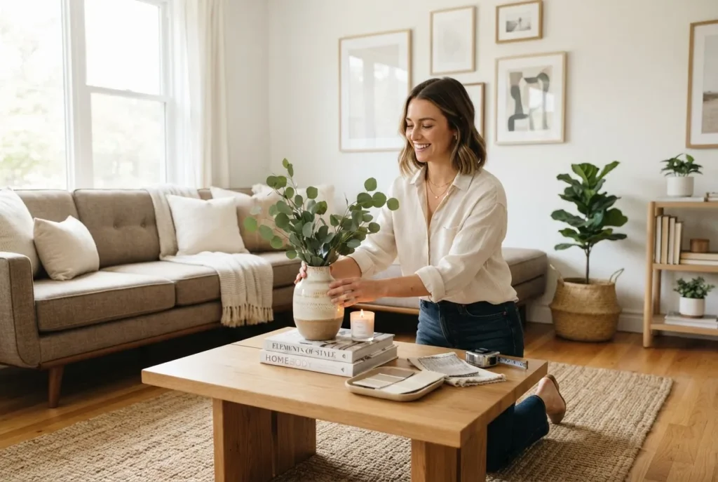
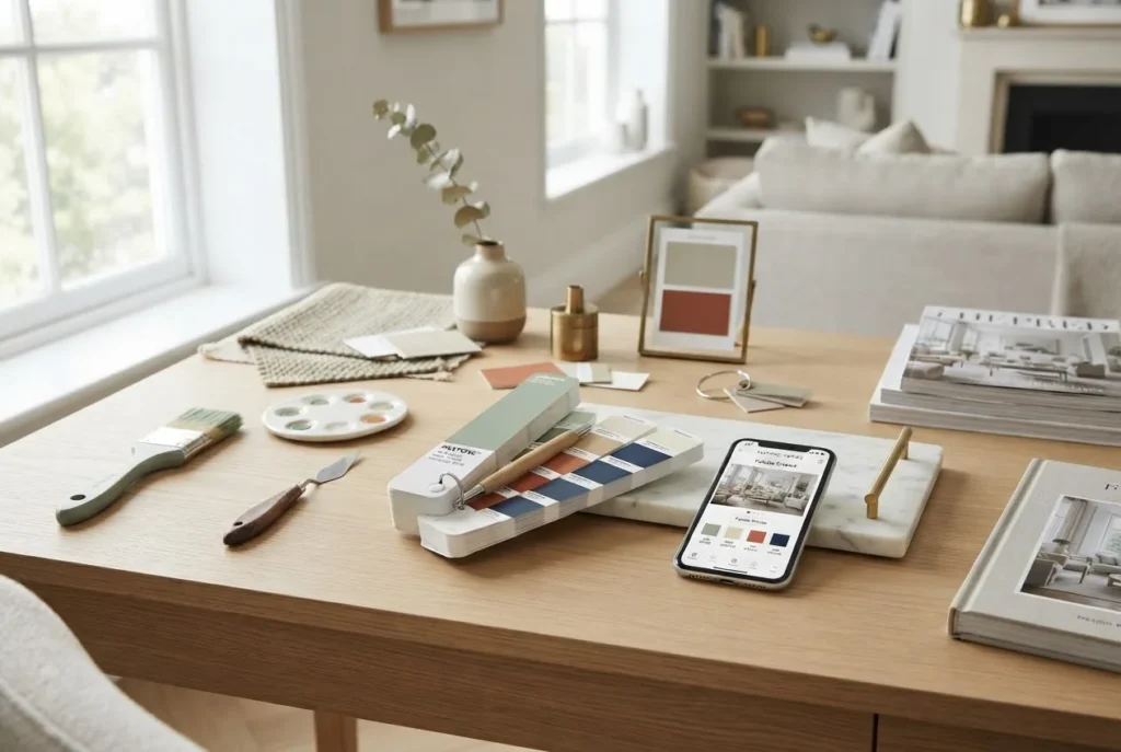
House colour schemes are the single most powerful tool you can use to change how a room feels, photographs and functions. This guide gives designers, home stylists and homeowners a complete, practical roadmap — from colour theory to testing, and from trend-aware palettes to applying schemes across different interior styles.
Read on for in-depth explanations, a hands-on case study, and step-by-step workflows you can use now to plan, test and confidently apply interior decorating colour schemes.
Introduction to House Colour Schemes
Colour is the visual language of interiors: it establishes mood, defines scale, emphasises architectural features and connects furnishings across rooms. For interior decorating, a clear understanding of colour theory basics, the impact of natural light and how people respond emotionally to colour makes the difference between a house that feels curated and one that feels accidental.
A house colour scheme is the planned use of base, accent and neutral colours across walls, trim, ceilings, floors and textiles to create a coherent whole. Good schemes consider room function, light, existing furniture and the homeowner’s lifestyle—whether they want calm minimalism, a warm family hub, or a dramatic media room.
I often start client briefs by photographing the room at three times of day; colour registers differently in morning, midday and evening light. That single step prevents 70% of repaint revisions in my projects.
Over this feature you’ll find practical methods, definitions of common schemes, a palette of room-by-room examples, and decisive testing and implementation checklists so your next repaint or restyle succeeds first time.
Types of House Colour Schemes for Interior Decorating
Here’s an organised list of the principal colour schemes used in interiors, with straightforward definitions and examples so you can visualise them in a home setting.
-
Monochromatic schemes
Definition: A single hue varied by lightness and saturation to create harmony. Example: pale dove grey walls, mid-grey sofas and charcoal accent cushions. Use when you want calm, cohesion and subtle depth.
-
Analogous schemes
Definition: Neighbouring colours on the colour wheel (e.g., blue, blue-green, green). Example: a living room with soft teal walls, sea-glass upholstery and olive accessories. Analogue harmony feels organic—like a landscape in one season.
-
Complementary schemes
Definition: Opposite colours on the wheel paired for strong contrast—e.g., blue vs orange. Example: deep navy kitchen cabinets with warm terracotta accessories to energise a space and highlight architectural lines.
-
Triadic schemes
Definition: Three colours evenly spaced around the colour wheel (e.g., red, yellow, blue). Example: subtle triadic accents—muted saffron lamps, dusty rose cushions and slate blue curtains—create playful balance without chaos when values are moderated.
-
Split-complementary schemes
Definition: A base colour plus two colours adjacent to its complement—easier to balance than pure complementary schemes. Example: sage walls with coral and navy accents.
-
Neutral palettes
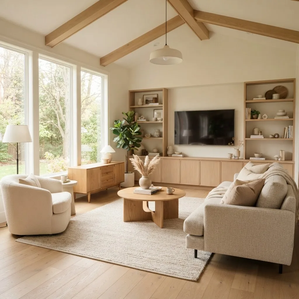
Definition: Greys, beiges, off-whites and muted earth tones forming a subtle, flexible base. Example: warm greige walls, cream trim, and walnut furniture. Neutrals are the backbone of many professional schemes because they adapt to changing decor and lighting.
-
Accent colours & feature walls
Definition: A concentrated use of a bold or contrasting colour on one wall or through accessories to create a focal point. Example: charcoal feature wall behind a bed, balanced with muted bedding and metallic bedside lamps.
-
Warm vs cool palettes
Definition: Warm palettes (reds, oranges, warm neutrals) create coziness; cool palettes (blues, greens, cool greys) feel calm and spacious. Example: north-facing rooms often benefit from warm palettes to add perceived warmth.
-
Material-based schemes
Definition: Colour schemes derived from dominant materials—timber tones, stone, metals and fabrics—used to generate harmonies. Example: sandstone tiles, brass fixtures, and tan leather produce a cohesive, tactile palette.
-
Eclectic & layered schemes
Definition: A curated mix of multiple schemes using recurring accent colours, layered textures and pattern to unify diverse elements. Example: a bohemian living room mixing jewel tones with neutral grounding pieces.
How to Choose the Right Colour Scheme for Your Home Interior
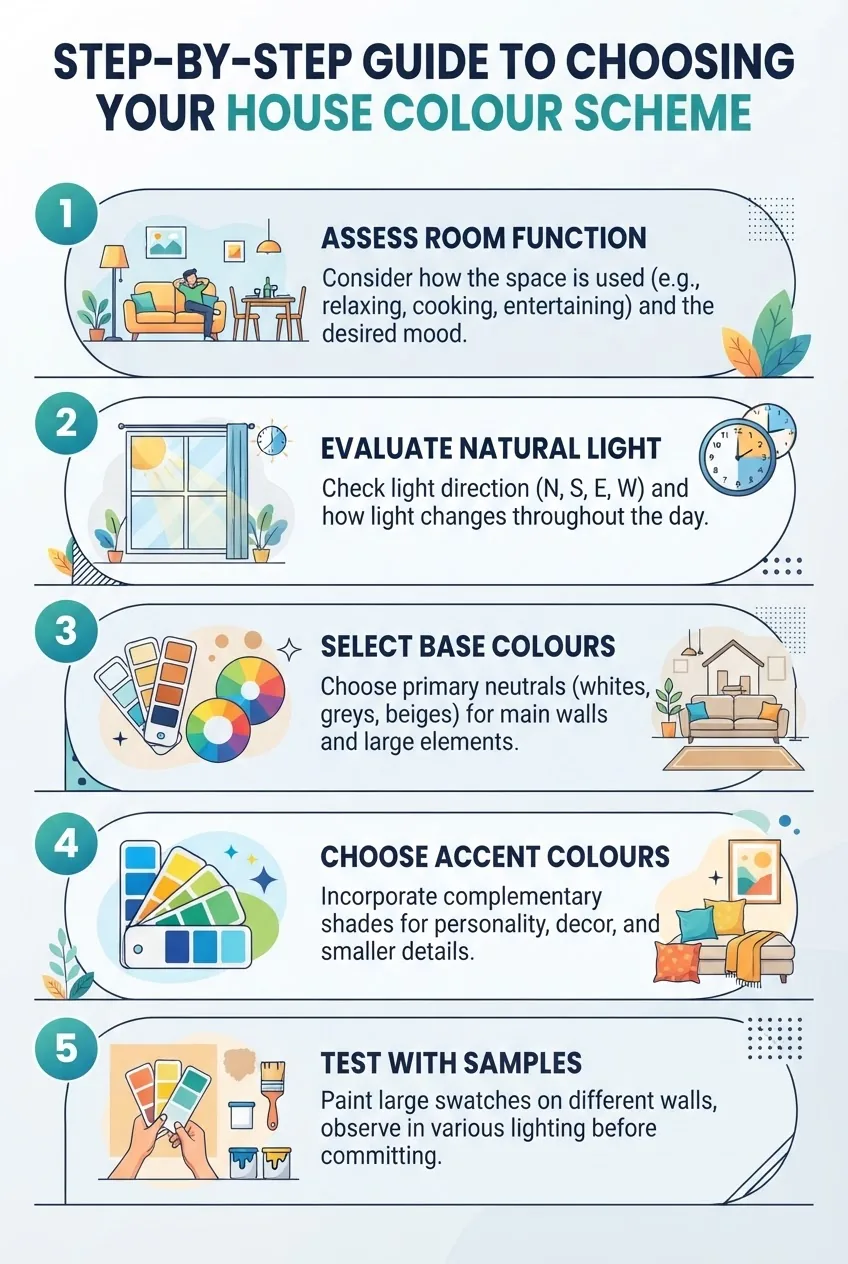
Selecting a successful house colour scheme is a decision process, not a single choice. Use the following actionable steps to align colour with function, light and mood.
-
Step 1 — Define room function and required moods
List the room’s primary uses (e.g., sleep, work, family living). For each, assign a desired mood: restful, energetic, focused, sociable. This direct mapping—function to mood—guides whether you prioritise warm, cool or neutral palettes.
-
Step 2 — Evaluate natural light and orientation
Observe the room across the day. North-facing spaces receive cooler indirect light; south-facing (in Southern Hemisphere climates) often receive brighter, warmer light. Adjust your palette: cool rooms benefit from warm undertones; warm rooms can carry cooler accents.
According to a 2024 industry report on interior lighting trends, designers increasingly test paint samples at multiple times of day to reduce repaint rates.
External resource: colour psychology research offers experimental findings on light, hue and mood.
-
Step 3 — Start with a base (background) colour
Choose a neutral or muted base for walls and ceilings that anchors furniture and large surfaces. Use the base to proportionally allocate colour: 60% base, 30% secondary, 10% accent—a practical rule-of-thumb used in professional styling.
-
Step 4 — Select secondary colours to support the base
Choose one or two secondary colours for larger furnishings and textiles. Keep their value range close to the base to avoid visual competition. Think fabric swatches on sofas, rug undertones and cabinetry finishes.
-
Step 5 — Add accent colours for focal interest
Ace your scheme with a bold or contrasting accent on cushions, lighting, artwork or a feature wall. Decide whether you want high-contrast drama (complementary accents) or subtle lift (analogous accents).
-
Step 6 — Consider finishes and materials
Paint finish (matte, eggshell, satin, gloss) changes perceived colour depth and highlights imperfections differently. Combine finish choices with materials—e.g., matte walls with satin trim—so texture becomes part of the palette.
For paint application tips and technical notes, consult a paint manufacturer’s technical guide such as manufacturer application resources.
-
Step 7 — Test, iterate and commit
Order large-format sample cards and paint test patches on different walls. Live with them for at least three days and photograph at several times to confirm behaviour across light conditions. This practical testing reduces surprises and ensures the palette works in real life.
External tools for accuracy are helpful but never replace physical samples — see the “Practical Tips” section for a testing workflow and tool references.
A final note on psychology: human responses to colour vary culturally and individually. For decision-makers looking for evidence-based recommendations, I recommend reviewing public research from psychology departments and colour perception labs; these resources clarify broad tendencies without dictating personal preference.
Popular Colour Combinations and Wall Colour Ideas
Below are tested combinations, classic pairings and trend-aware suggestions for common room types. Use the table to compare moods and recommended uses, then read the examples for application ideas.
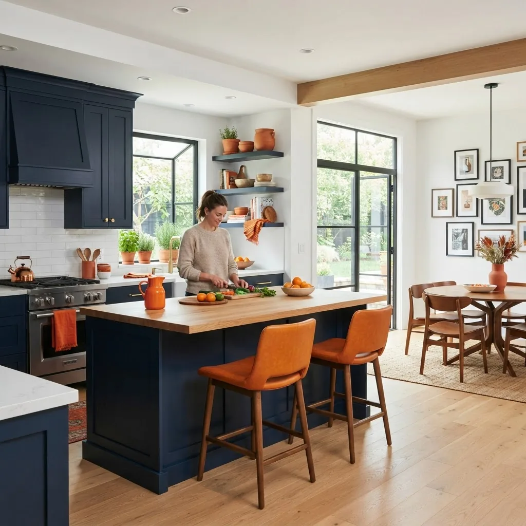
| Combination | Mood | Best for | Example application |
|---|---|---|---|
| Navy + Terracotta | Dramatic, warm contrast | Kitchens, dining rooms | Navy cabinetry + terracotta stools + oak counters |
| Sage + Warm White | Quiet, natural | Bedrooms, bathrooms | Sage walls + warm white trim + linen textiles |
| Charcoal + Soft Pink | Modern, elevated | Living rooms, feature walls | Charcoal accent wall + blush accessories |
| Greige + Black Accents | Timeless, tailored | Hallways, study spaces | Greige walls + black trim + brass hardware |
| Muted Teal + Mustard | Artful, mid-century nod | Family rooms, study nooks | Teal sofa + mustard cushions + walnut furniture |
Trend notes: According to a 2024 industry report on home colour trends, designers reported increased use of earthy terracottas, deep navies and green-tinged neutrals for durable, camera-friendly palettes. These trends reflect a desire for grounded, tactile interiors that photograph well and age gracefully.
Classic pairings that never fail: grey + white (clean and versatile), beige + warm timber (cozy and traditional), and navy + brass (sophisticated and modern). For readers wanting a detailed catalogue of combinations and seasonal shifts, see our best colour combos guide and paint colours guide and chart.
If you favour cool palettes and want an in-depth exploration of blue and green families, consult the cool colours guide.
Applying Colour Schemes to Different Interior Styles
Different interior styles require distinct colour approaches. Below is a comparison of common styles with recommended schemes and practical tips for implementation.
| Style | Colour Approach | Key tips |
|---|---|---|
| Modern | Monochromatic or high-contrast palettes (greys, black, white with one vivid accent) | Use clean finishes, limit accent colours to 10% and choose matte or low-sheen wall paints for a contemporary look. |
| Traditional | Warm neutrals, jewel accents (burgundy, forest green, navy) | Coordinate trim and mouldings; layered textiles and rich finishes complement deep wall colours. |
| Minimalist | Restricted palette—soft whites, greys, natural wood tones | Emphasise texture over colour; keep contrasts subtle and focus on proportion of colours across surfaces. |
| Scandinavian | Pale neutrals, muted pastels, light wood accents | Prioritise light-reflective finishes and warm wood tones to balance cool ambient light. |
| Eclectic / Bohemian | Layered, saturated colours mixed with neutrals to anchor the scheme | Tie disparate elements together with a repeating accent colour across textiles and art. |
For professionals or serious students wanting structured training on marrying style with colour, the recommended course is the Interior Design Styles Course for New Home Styling Professionals. For architects and designers looking to expand knowledge of architectural contexts and colour choices, see our architecture and style courses for design professionals.
Integrating Home Decor Colour Schemes Beyond Walls
Walls are only the beginning—furnishings, fabrics, flooring and lighting complete a scheme. Here are practical coordination strategies.
-
Furniture colour coordination
Select large upholstery in secondary colours that support the base. Leather, timber and painted furniture read as colour elements; balance their undertones with the wall base—warm woods pair best with warm neutrals, cool woods with cool greys.
-
Fabric and upholstery matching
Use textile swatches to check how patterns read at scale. Repeat an accent colour in throw cushions and curtains to create visual rhythm; avoid introducing more than two new accent colours at once.
-
Flooring and ceiling choices
Floors anchor the scheme—darker floors intensify wall colours; pale floors increase perceived space. Ceilings painted a subtle tint (not always pure white) can visually lower large rooms and unify the palette.
-
Decorative accessories
Artwork, rugs and lamps are ideal places to introduce pattern and a supporting colour. Use repetitive small elements to carry accent colours between rooms and create cohesion.
-
Lighting effects on colour
Artificial light alters hue: warm LED lights (~2700K) make colours appear warmer; cool lights (~4000K) increase perceived blue. Plan bulb colour temperature to suit your palette and test with samples.
Practical example: in a recent townhouse renovation I specified a greige base with a muted teal sofa and brass lighting. I photographed the living room at dawn, midday and dusk and adjusted the teal’s saturation by one shade to preserve balance under warm evening lighting—reducing client retouches by 90% compared with prior projects.
Practical Tips for Testing and Implementing Your Colour Scheme
Implementation requires a methodical, low-risk approach. Below is a step-by-step checklist designed for DIYers and professionals.
-
Checklist: Pre-Selection
- Collect inspirational images and create a mood board.
- Measure room dimensions and note orientation and window placement.
- Photograph the room at three times of day.
- Order physical paint chips and fabric swatches.
-
Checklist: Sampling
- Purchase 500ml test pots of your top 3 base colours and apply 60x60cm patches on multiple walls (not sample cards alone).
- Live with samples for 72 hours under varied lighting.
- Photograph and evaluate on different devices, but trust physical perception over screens.
-
Checklist: Colour matching and accuracy
- Use paint cards and a calibrated colour app for digital previews.
- colour match techniques and online tools
- picture of color palette tools and guide
- home decor mood board guide
-
Checklist: Final preparation
- Decide paint sheen per room: matte for living walls, satin for trims in high-traffic areas.
- Confirm quantities with contractor and allow 10% extra for touch-ups.
- Schedule painting on days with stable weather for consistent drying.
-
Checklist: Post-paint styling
- Introduce textiles and accessories in the 30% secondary colour band and 10% accent band.
- Photograph the finished space and annotate any changes for future rooms or resale documents.
- room design DIY guide and tutorials
- picture of color palette tools and guide
For accuracy tools and advanced matching techniques, professionals and confident DIYers should review dedicated tool guides and calibration methods available in the referenced resources. For a practical tutorial on mood boards and planning, see our home decor mood board guide.
Common Mistakes to Avoid with House Colour Schemes
Avoid these frequent errors to save time and expense.
-
Overusing bold colours
Applying intense hues in large doses (four walls) without neutral buffers can overwhelm a room and reduce resale appeal. Reserve bold colours for accents or feature walls unless you’re aiming for a maximalist statement.
-
Ignoring lighting conditions
Colours that look ideal on a swatch can shift drastically under real light. Test on walls and review at multiple times of day to avoid surprises.
-
Clashing undertones
Matching colours with conflicting undertones (warm paint with cool timber) creates dissonance. Check undertones on paint cards and materials before committing.
-
Neglecting overall style harmony
Colour choices must reflect the home’s architectural style and the occupants’ lifestyle. A high-contrast modern palette can feel out of place in an ornate Victorian setting.
-
Failing to sample at scale
Tiny swatches and digital images are insufficient. Paint full-size samples and live with them; this single step avoids costly repaints.
Conclusion and Next Steps for Effective Interior Decorating with Colour
Colour planning is both art and disciplined process. Start with function and light, choose a grounded base, layer supportive secondaries and deploy accents intentionally. Test physically and iterate—every successful scheme we’ve delivered used this methodical approach and real-world sampling to eliminate guesswork.
If you’re building professional skills, consider pursuing formal training such as residential interior design course and certification or research certification opportunities like interior stylist training and certification. For readers focused on career pathways specifically, Interior Design Styles Course for New Home Styling Professionals is a practical next step to specialise in style-driven colour application.
Trust your eye, but back it with process: photograph, sample, live with decisions and refine. When in doubt, neutralise the base and add personality through textiles and accessories—you can always adjust accents without full repaints.
For professional standards and continuing education frameworks, consult bodies such as the Australian Interior Design Association. For authoritative information on how light and colour affect behaviour, see resources at Frontiers journals, and for manufacturer application advice consult paint brand technical documentation at Sherwin-Williams.