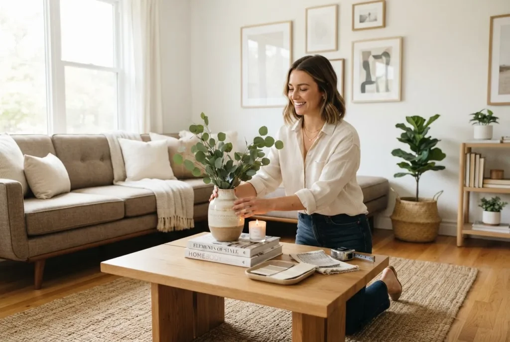
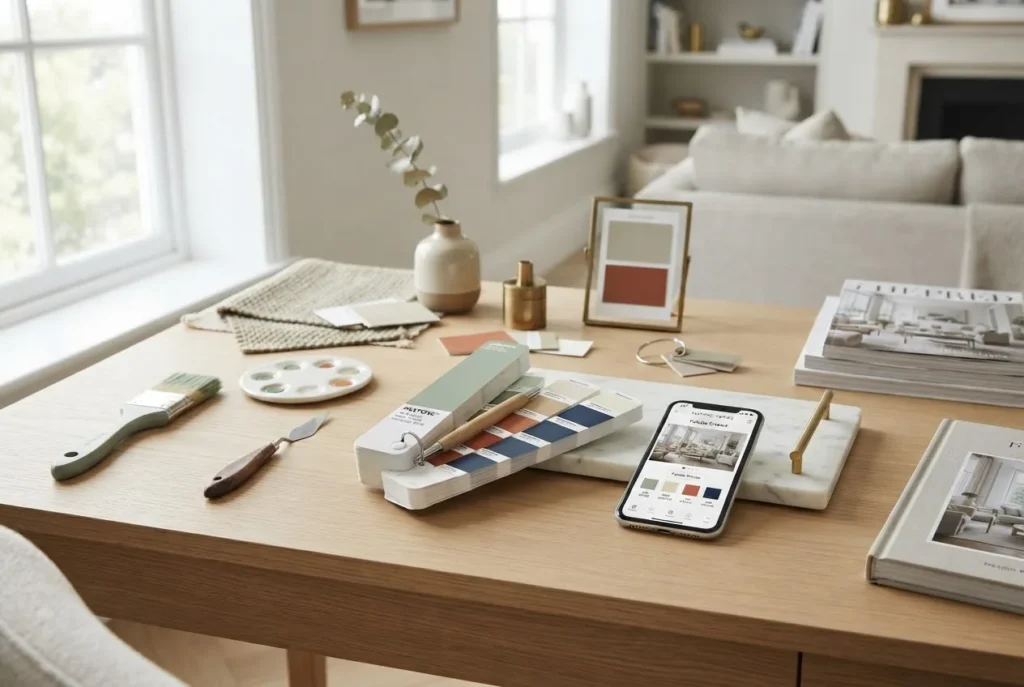
Best colour combos for interior decorating are the tools you need to transform a room into a living, breathing space. By the end of this hands-on guide you will have built and tested a 3- and a 5-colour palette, applied them to a living room and bedroom mock-up, and produced a mood board you can use on site. Expect to spend 6–10 hours on a single-room scheme; skill level: confident beginner to intermediate (no formal design training required).
Before you start, gather paint chips, a digital palette tool, sample textiles, and a camera. This guide is written as a step-by-step practitioner manual so you can follow and reproduce results in a real home environment.
Before you start
- Materials: 6–10 paint swatches (25–50 mm), fabric samples for upholstery/curtains, non-permanent sample tiles.
- Tools: phone camera, colour-picker app or digital palette tool, printed colour wheel (physical), tape measure, notepad.
- Time allocation: 2 hours to create palettes + 4–8 hours to test and refine per room.
- Reference reading: a copy of Josef Albers’ Interaction of Color (for exercises) and a recent 2023 interior trend report for palette shifts.
Transition: Now start with the strategic context — why colour choices matter and how to avoid common early mistakes.
Introduction to Best Colour Combos for Interior Decorating
This section explains what makes the best colour combos for interior decorating and how architectural context, light and occupant behaviour shape palette choices. Colour isn’t decoration alone; it’s a spatial organiser that affects perceived size, mood, and usability.
Architectural features — ceiling height, natural light orientation, window proportions and fixed materials such as timber or stone — restrict and guide palettes. For a deeper look at how architecture and finishes interact with colour choices, see architecture and style courses. That resource helps you factor building geometry into palette selection.
Good colour pairings in real homes balance three practical demands:
- Function — How the room is used (e.g., high-traffic living room needs stain-tolerant mid-tones).
- Perception — How colour alters perceived volume and depth (cool colours recede; warm colours advance).
- Emotion — The psychological impact on occupants (more on this below in Colour Psychology).
What to expect from this guide: practical, room-by-room combos, clear how-to steps for building and testing 3-colour combos and five-colour palettes, and proven formatting for applying patterns and textures. We’ll avoid theoretical-only advice and focus on how colours behave in real light and with fabrics, stone, and timber.
Transition: Next we’ll build the foundation — clear, applicable color theory you can use while assembling palettes and mood boards.
Colour Theory Basics: Foundation for Choosing Colour Combinations
Understanding the basics of colour theory gives you repeatable rules to generate reliable palettes. We’ll cover the colour wheel, complementary colours, analogous and triadic relationships, value and saturation, warm vs cool palettes, and how to choose background colours that let accents sing.
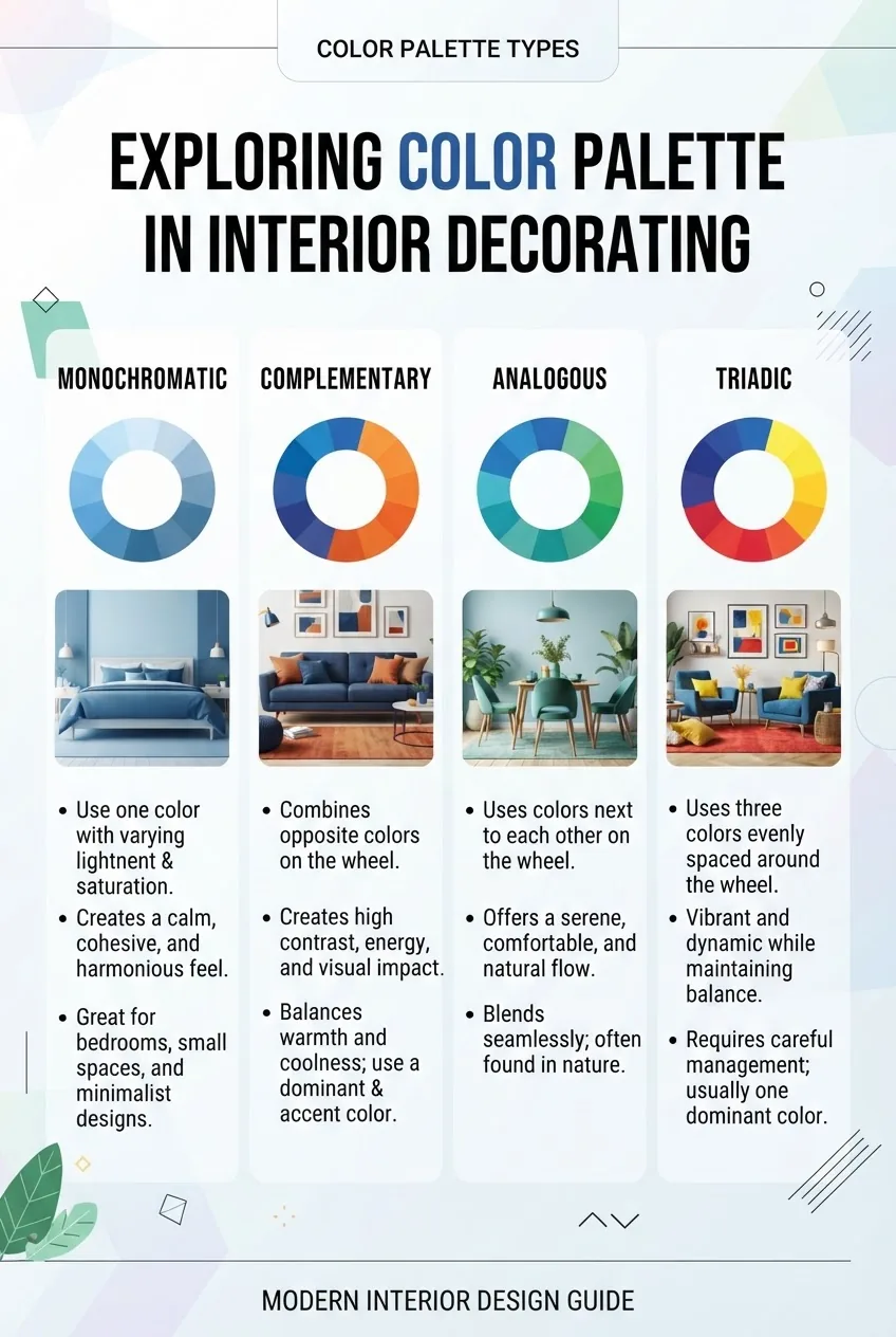
At its core, the practical wheel divides hues into three relationships that matter for interiors:
- Complementary colours — opposite hues on the wheel (e.g., teal and terracotta). These create contrast and energy; use them as a primary and accent to avoid visual fatigue.
- Analogous colour schemes — adjacent hues (e.g., sage, moss, and olive). These read as harmonious and subtle, good for restful spaces.
- Triadic colour combinations — three hues evenly spaced around the wheel (e.g., navy, mustard, and coral). These create dynamic balance when you control value and saturation.
Value (lightness) and saturation (intensity) are often ignored by DIY decorators but are decisive. A mid-value, desaturated navy can sit in a living room without overpowering wood tones, whereas a high-saturation neon will dominate regardless of hue.
Warm vs cool colour palettes: warm tones (reds, oranges, ochres) advance and make rooms feel cozier; cool tones (blues, greens, violets) recede and can make a space feel larger or calmer. Mixing them is powerful: a cool base with warm accents (e.g., pale blue walls + terracotta cushions) can feel modern and inviting.
Practical selection tip: test colours on 60 cm x 60 cm painted boards and view at different times of day and under artificial light (measurements: midday daylight, 2700K warm LED, 4000K neutral LED). If a hue shifts more than two perceived steps between lighting conditions, mark it as variable and plan neutrals around it.
For detailed procedures on picking background tones that make accents work, consult the background colours guide and for shade relationships see the colour shade guide and training.
Authority and evidence: colour theory fundamentals date back to artists such as Goethe and modern practitioners such as Josef Albers (Interaction of Color). For psychological effects, see research reviews on colour and psychological functioning (peer-reviewed studies). According to a 2024 industry report on residential design trends, muted, desaturated palettes with one saturated accent are dominating bookings for staged homes (source: 2024 industry report).
Transition: armed with these fundamentals, you can choose the right palette type for your room — next we’ll list the most practical, widely used palette structures and when to use them.
Popular Types of Colour Palettes and Combos for Interiors
This section lists palette types with practical use-cases, pros and cons, and a recommended structure for a 3 colour combo and a five colour palette. Add a physical or digital swatch for each palette you test.
-
Monochromatic — single-hue depth
Structure: base wall tone (60%), secondary (30%), highlight (10%). For a 3 colour combo use three values of the same hue (e.g., pale dove grey, mid-steel grey, charcoal). For a five colour palette add two textures (warm wood + cool metal) to introduce complexity.
Use-case: Scandinavian minimalism, modern bedrooms, small apartments that benefit from visual continuity.
Pros: Safe, elongates space, easy to execute. Cons: Can feel flat without texture; risk of monotony.
-
Complementary — high-contrast balance
Structure: dominant neutral or one colour (65%), complementary accent (25%), small neutral/metal (10%). Example 3 colour combo: soft blue walls, terracotta sofa, crisp white trim.
Use-case: Living rooms that need energy; entry halls; accent walls.
Pros: Vibrant and clear focal points. Cons: Overuse can be visually noisy; needs careful value control.
-
Analogous — harmonious transitions
Structure: choose three adjacent hues (60% base, 30% secondary, 10% accent). Example: mint (walls), sage (sofa), olive cushions with warm timber floor.
Use-case: Bedrooms, studies, and spaces for relaxation.
Pros: Calm, cohesive. Cons: Subtlety requires texture to avoid flatness.
-
Triadic palettes — vibrant but controlled
Structure: pick three evenly spaced hues; manage by using one dominant and two accents. Example 3 colour combo: navy base, mustard cushions, coral accessories (with white trim).
Use-case: Contemporary, eclectic interiors that want colour energy without chaos.
Pros: Energetic, versatile; works well with patterns. Cons: Harder to balance; can feel busy if saturation levels are equal.
-
Neutral with a pop — perennial winner
Structure: neutral base (70%), mid-tone secondary (20%), bright accent (10%). A five colour palette can split neutrals between warm and cool (e.g., warm beige walls, cool grey upholstery, pale blue rug, ochre cushions, brass lamp).
Use-case: Whole-house schemes, resale-focused decorating, rental updates.
Pros: High market appeal, easy to tweak. Cons: May lack personality if overused.
-
Warm-led vs cool-led palettes
Difference: warm-led palettes use ochres, terracottas, warm whites; cool-led palettes use blues, greens and greys. Use warm-led in north-facing rooms to add perceived heat; use cool-led in south-facing or sunny rooms to temper glare.
Pros and cons: Warm palettes feel intimate but can reduce perceived space; cool palettes expand visual space but may feel sterile without texture.
-
Five-colour palettes — controlled complexity
Structure: 2 neutrals, 1 dominant hue, 1 secondary tie-in, 1 accent (e.g., white trim, warm taupe walls, navy sofa, mint cushions, brass accents). Use a layout grid to allocate percentages: 40/25/15/10/10.
Use-case: Open-plan homes where multiple zones require consistent ties.
Pros: Rich, layered styling. Cons: Hard to manage without a mood board.
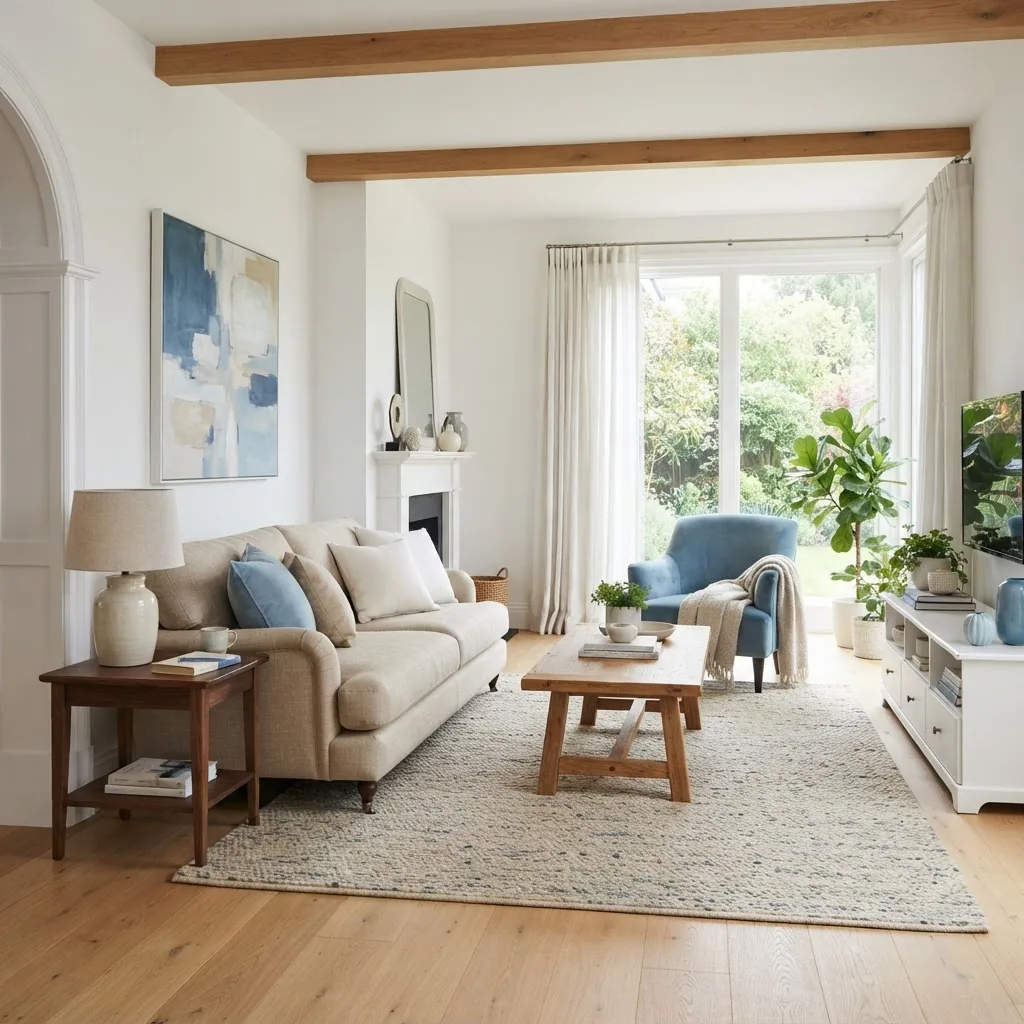
Practical paint reference: before deciding, consult the paint colours guide and chart for pigment behaviour and recommended finishes (eggshell vs satin for living rooms; semi-gloss for trims).
| Palette Type | When to use | Best for |
|---|---|---|
| Monochromatic | Small rooms, minimalist schemes | Bedrooms, studies |
| Complementary | Accent walls, focal furniture | Living rooms, dining rooms |
| Analogous | Relaxing atmospheres | Bedrooms, lounges |
| Triadic | Dynamic, eclectic interiors | Kitchens, creative spaces |
Transition: After choosing a structural palette type, the practical skill is to create a balanced pattern of colours in the space — next section gives step-by-step instructions for mixing solids and patterns.
How to Create a Balanced Pattern of Colors in Your Decorating
Creating a coherent pattern of colors in a room means distributing hue, value and texture so the eye moves easily and focal points are clear. This section gives stepwise, repeatable rules and examples for mixing patterns and solids and for colour blending techniques.
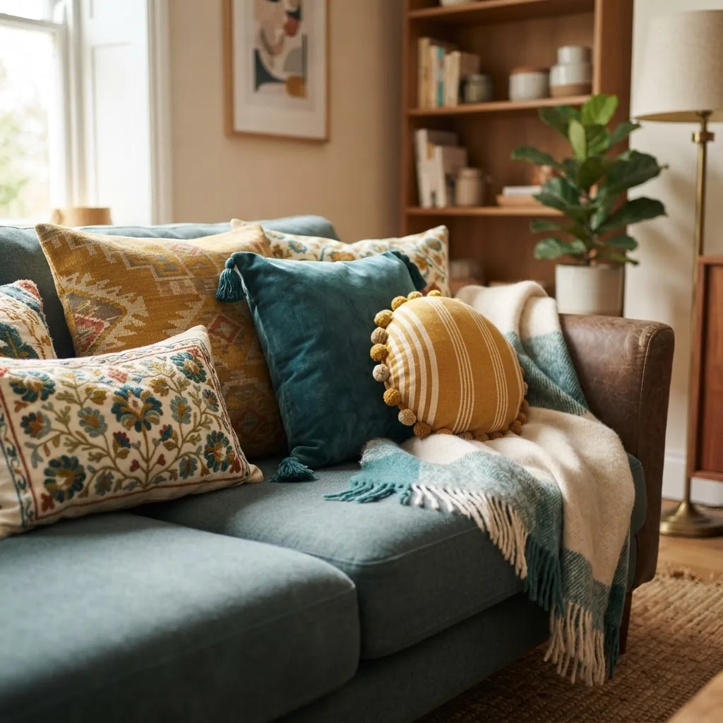
- Start with a dominant anchor: Choose one dominant element (walls or a large sofa). Assign it 50–65% visual weight. Example: dove-grey walls for a living room.
- Add a secondary layer: Introduce a secondary colour for large movable items (rug, curtains). Assign 20–30% weight. Example: muted navy rug to ground the space.
- Introduce accents: Use 1–2 accent colours for cushions, lamps, and art—each at 5–10% visual weight. Keep accents in a tighter saturation range to avoid clashing.
- Match pattern scale to room size: Large-scale patterns suit big rooms; smaller rooms need micro-patterns. Rule of thumb: one large pattern, one medium, one small. If using three patterns, make one pattern monochrome to reduce complexity.
- Use a unifying neutral: Add a neutral (white, warm beige or greige) across three surfaces (trim, ceiling, one large textile) to tie disparate hues together.
- Blend with transitional tones: When combining warm and cool palettes, use a transitional hue (e.g., warm grey or warm white) to soften the junction. This acts like a buffer and reduces perceived clash.
- Layer textures: Velvet, linen, jute and polished metal change perceived saturation—introduce at least three material textures to give depth. Keep textured items in the same value band as their colour so texture, not hue, becomes the primary differentiator.
- Test on site: Install 300 x 300 mm test panels and live with them 48–72 hours under all lighting conditions. Photograph at 0900, 1300, 1800 local time to observe shifts; note changes of more than 10% in perceived brightness as a flag to reconsider the hue.
- Anchor with pattern repeats: Repeat one accent colour across at least three object types (e.g., cushions, vases, artwork) to create a visual rhythm.
- Adjust saturation not hue: If a colour feels too loud, reduce saturation or increase value (lighter). Adjusting saturation keeps the hue identity while restoring balance.
Example: To create a balanced scheme using teal, mustard, and ivory, set ivory walls (60%), teal sofa (25%), mustard cushions and a throw (10%), and brass lamp (5%). Use a patterned rug that combines teal and ivory to integrate the sofa with the floor.
Practical technique—colour blending: when two colours don’t blend, create an intermediate step by adding a third, desaturated hue between them (e.g., if teal collides with bright ochre, add a muted olive as a bridge). This three-step blend reduces chromatic tension.
Transition: With patterns and blends controlled, we can apply these combos room-by-room — the next section shows specific palettes and styling approaches for living room, kitchen, bedroom and bathroom aligned with popular design styles.
Applying Best Colour Combos by Room and Style
This room-by-room breakdown gives ready-to-use palette formulas and styling steps aligned with common interior styles: modern, coastal, Scandinavian, industrial and eclectic. Use the 40/25/15/10 design percentages rule for allocating colours across surfaces and objects.
-
Living Room — modern coastal palette (case study)
Palette: soft blue (walls 40%), warm beige (sofa 30%), crisp white (trim 15%), driftwood timber (10%), coral accent (5%).
Steps: paint sample boards in the main window light, install a mid-tone rug that ties blue and beige, place beige sofa centered on rug, add coral accent cushions and art. Lighting: 2700K warm LED uplights to balance the blue walls. Resulting mood: breezy, calm and market-friendly.
Why it works: blue recedes to visually enlarge the room while beige adds warmth; crisp white provides contrast on trims.
For whole-house strategies, compare to the house colour schemes guide to maintain cohesion between rooms.
-
Kitchen — triadic energy
Palette: deep navy cabinetry (dominant 45%), warm terracotta backsplash (secondary 25%), soft white counters (20%), brushed brass handles (5%), green plant accents (5%).
Steps: choose cabinetry finish and test against countertop samples; use terracotta tile swatches under daylight. Keep walls neutral to avoid busy surrounds. Lighting: 4000K task lighting over prep areas; dimmable 2700K for atmosphere.
Why it works: the triadic structure (blue/terracotta/green) creates an energetic focal point that’s grounded by white surfaces.
Tip: check the paint colours guide and chart for recommended kitchen-friendly paint formulas and VOC details.
-
Bedroom — analogous serenity
Palette: misty sage walls (55%), olive bedding (25%), warm walnut furniture (10%), ivory linen (7%), soft blush accents (3%).
Steps: choose bedding and curtain fabrics first (they’re easy to change), then choose wall tone. For restful spaces aim for 40–60% desaturation. Use blackout curtains in coordinating olive to add depth and privacy.
Why it works: analogous greens create a cocooning effect; small blush accents warm the scheme subtly.
DIY resources: see the room design DIY guide and tutorials for step-by-step painting and upholstery tips.
-
Bathroom — neutral with a pop
Palette: warm grey tile (60%), crisp white sanitaryware (25%), marine blue vanity (10%), chrome fixtures (5%).
Steps: use porcelain tile samples under bathroom lighting before committing; small spaces benefit from reflective surfaces and a single saturated accent (the vanity).
Why it works: neutral tiles enlarge visual space; a marine vanity creates a focal point without overwhelming.
-
Open-plan zones — five-colour palette strategy
Palette example and allocation: living (taupe 40%), dining (muted olive 20%), kitchen (navy 15%), shared accents (ochre 15%), metal finishes (brass 10%).
Steps: pick 2 consistent neutrals for walls and joinery, then use three accent colours repeated across zones to create movement. Test in the largest light condition in the house (usually midday) and walk the space to confirm transitions.
Why it works: repeating 2–3 accents across zones ties the open plan together while allowing each area to have a distinct mood.
Lighting and scale tips: in small rooms, lower saturation by one step and increase contrast via texture; in large rooms, use higher saturation and larger-scale patterns. North-facing rooms gain warmth from warm palettes; south-facing rooms take cooler tones well.
Transition: Once the room palette is applied, integrate patterns, textures and accents to elevate the scheme — next section explains how.
Enhancing Interior Decor with Patterns, Textures, and Accents in Matching Colour Combos
Fine styling is the difference between a painted room and a staged, liveable interior. This section covers practical ways to layer textures and patterns so colours that go great together become memorable combinations rather than mismatched attempts.
Start with three textural layers:
- Structural surfaces (floors, walls, fixed cabinetry)
- Large soft furnishings (sofas, beds, curtains)
- Small accents (cushions, vases, art)
Method:
- Choose a dominant texture: e.g., natural linen for a casual look or leather for a sleek aesthetic. Keep the dominant texture within the 40–60% visual weight range.
- Introduce contrast textures: Add a tactile contrast such as a chunky knit throw or a silk cushion to create focal points that let small accents read clearly.
- Use pattern repetition: Pick one pattern family (florals or geometrics) and use variations in scale. For example, a large-scale geometric rug, medium-scale striped curtains, and small-scale patterned cushions all sharing a common accent colour.
- Balance metallics and woods: Use warm metals (brass, copper) to lift warm palettes; use nickel or chrome with cool palettes. Timber tones should harmonise with base neutrals (e.g., warm oak with beige bases; pale ash with grey bases).
- Art and accent walls: Use art to introduce a new accent but repeat at least one accent colour from the art across three focal objects to avoid it feeling foreign.
Case example: a living room with an olive sofa (dominant), cream walls, a patterned rug combining olive and rust, velvet mustard cushions (accent) and a woven jute pouf (texture). The repetition of mustard in cushions and an occasional plant pot ties the colour through the space.
For further styling techniques, see the interior styling tips guide which expands on object placement, scale and lighting used to support colour choices.
Transition: Even the best plans can go wrong — the next section lists common mistakes and remedies drawn from real project experience.
Common Mistakes and Troubleshooting when Choosing and Using Colour Combos
- Over-saturating every surface: Mistake — using three highly saturated hues at full intensity. Fix — desaturate two elements and keep one saturated accent (5–10%).
- Ignoring lighting: Mistake — choosing colours only from smartphone images. Fix — test with 300 x 300 mm panels and view under all lighting conditions for 48–72 hours.
- Mixing too many pattern scales: Mistake — several large-scale patterns competing. Fix — ensure a hierarchy: one large, one medium, one small; or convert one pattern to monochrome.
- Using paint swatches alone: Mistake — trusting paper chips without textiles or metal samples. Fix — include fabric and finish samples; attach them to the test panel.
- Assuming trends trump context: Mistake — forcing the latest popular palette regardless of architecture or client needs. Fix — adapt trends to the site: for example, reduce saturation in small rooms.
Transition: When tools are necessary to plan and validate colour combos, use the right digital and physical resources — next section lists the best ones and how to use them.
Tools and Resources to Plan and Visualise Your Colour Combos
Use a mix of physical and digital tools to ensure accuracy. Below are recommended resources with practical pros and cons.
- colour match techniques and online tools — Digital palette generators and colour-picking apps. Pros: speed, palette export; Cons: screen calibration affects accuracy.
- home decor mood board guide and tools — Use for arranging swatches, photos and notes. Pros: visual planning; Cons: requires image quality control.
- picture of color palette tools and guide — Reference images and swatch photography techniques. Pros: replicates on-site light; Cons: camera white balance can mislead.
- picture of color palette tools and guide — For physical paint chips and finish recommendations; pros: tangible, accurate; cons: storage and cost.
- picture of color palette tools and guide — repeated for emphasis when photographing swatches (use correct white balance).
External authoritative resources:
- Colour psychology research review — peer-reviewed overview of colour effects on mood.
- Colour theory fundamentals — comprehensive practical reference on hue, value and saturation.
- International interior design resources — professional standards and guidance for interior projects.
Also see the picture of color palette tools and guide and the home decor mood board guide and tools for practical steps to create a mood board and test schemes before purchase.
Transition: Finally, we summarise and point you toward training if you want to turn this practice into a professional skill.
Conclusion and Next Steps for Mastering Colour Combos in Interior Styling
This hands-on guide has walked you through colour theory basics, complementary and analogous rules, triadic structures, how to build 3-colour combos and five-colour palettes, colour psychology, pattern of colors integration, and room-by-room application. You should now be able to create, test, and refine palettes that work under real lighting and with physical materials.
Next steps: compile your successful palette into a mood board, create a test panel and run the 48–72 hour lighting check. If you want to deepen your professional capability, consider the Interior Design Styles Course for New Home Styling Professionals for structured instruction on applying colour combos across whole houses.
If you’re considering certification or a design career pathway, explore the interior stylist training and certification and the residential interior design course and certification to formalise your practice.
Final practical note: always photograph your test panels and palette layouts and keep dated notes; this empirical approach builds reliable intuition for future projects.
Common mistakes and how to avoid them (practitioner notes)
I once specified a saturated teal for a north-facing living room without testing the paint in-situ; under cool light it became muddy. Lesson: I now always wait 48 hours and photograph at three times of day. In another job I matched two fabrics by eye and they clashed under warm lighting; now I use a reference card and a colour-picker app to confirm matched values.
Checklist — confirm before final purchase
- Have you created a 300 x 300 mm test panel and lived with it 48–72 hours?
- Do you have a dominant, secondary and accent colour with approximate percentage splits (e.g., 40/25/15/10)?
- Have you repeated your main accent across at least three objects in the room?
- Are patterns balanced by scale (one large, one medium, one small)?
- Have you compared samples under final light fittings (daylight + chosen LEDs)?
When to call in a professional
Hire a professional when you’re doing whole-house schemes with multiple connected zones, specifying high-cost finishes (stone, joinery), or preparing a home for sale where colour decisions impact valuation. For training, consider the interior stylist training and certification and the residential interior design course and certification.