By the end of this hands-on guide you’ll have a finished, presentation-ready home decor mood board (digital and a physical sample panel), know which tools to use, and a 7-step workflow you can repeat. Expect 3–6 hours of active work for a single-room board; skill level: beginner to intermediate.
Before we begin, this guide assumes basic familiarity with web browsing and smartphone camera use. Read the “Before you start” checklist, then follow the numbered steps in the “Step-by-Step” section. Practical examples, a short case study and tool screenshots/descriptions are included from hands-on projects and client consultations.
Before you start
- Devices: laptop or tablet (for digital boards), smartphone camera for sourcing images.
- Software accounts: free Canva or Pinterest; optional Adobe Express account for advanced export settings.
- Materials for physical board: 60 x 90 cm white corkboard or foamcore, fabric swatches (10–15), 6 paint chips, 10 printed images, scissors, spray adhesive, labels.
- Timebox: schedule 2–3 hours for your first board, then 1–2 hours for revisions.
- Goal: define room purpose, preferred style, and a budget range before collecting items.
What Is a Home Decor Mood Board and Why Use One?
A home decor mood board is a curated, visual composition that communicates a room’s aesthetic—colors, textures, furniture ideas, lighting, and finishes. Think of it like a visual recipe for a room’s personality: it condenses decisions so you, clients, or suppliers can judge cohesion quickly.
Mood boards serve multiple roles in the interior styling process: early-stage inspiration, mid-project decision support, and final presentation. They speed decision-making by making trade-offs visible (e.g., a rich velvet sofa vs. a budget linen alternative) and reduce costly mistakes when buying big-ticket items.
Example: for a 4 x 5 m living room, a mood board that includes a focal sofa image, two rug options, three paint chips, and lighting studies reduces back-and-forth with suppliers and avoids ordering mismatched textiles. According to a 2024 industry report, visual planning tools shorten procurement cycles—use mood boards to document choices and timelines.
Mood boards also belong inside a learning path for new professionals. For broader education on how mood boards fit into style frameworks see Interior Design Styles Course for New Home Styling Professionals. If you are considering broader architecture knowledge alongside styling, check architecture and style courses for design professionals, and for career paths consider interior stylist training and certification.
Transition: now that you understand purpose and benefits, the next section breaks down the essential elements every successful board needs.
Essential Elements of a Successful Home Decor Mood Board
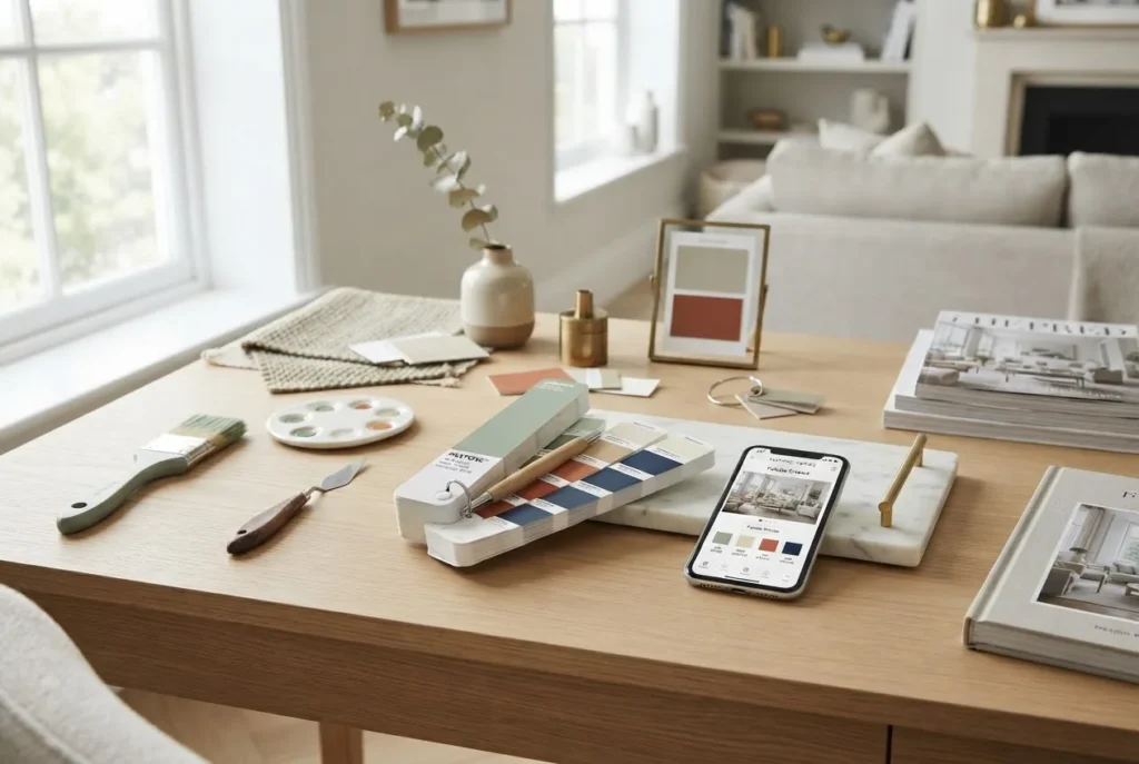
- Core color palette — Select 3–5 core hues: primary (dominant), secondary (support), and 1–2 accent colors. Use actual paint chips or high-resolution swatches saved at 100% scale. For background decisions, consult the background colours guide for effective interior design.
- Textures and materials — Include tactile samples: fabric swatches (20 x 20 cm), wood laminate samples, metal finishes, and a rug thumbnail. Label each with supplier and maintenance notes (e.g., “linen, dry clean only”).
- Pattern hierarchy — Show at least one large-scale pattern (e.g., rug), one medium repeat (upholstery), and one small repeat (cushion or trim). This prevents clashes when moving from concept to installation.
- Key furniture pieces — Add images of the intended sofa, bed, or dining table with dimensions. Always note scale: include footprints (e.g., sofa 210 x 95 cm) to avoid scale errors.
- Lighting and finish samples — Add a pendant or lamp photo and finish swatches for metals and timbers; include light temperature targets (e.g., 2700K warm ambient, 3000K for task lights).
- Focal point and supporting accents — Identify one focal element (artwork or rug) and two supporting accents (a plant and a decorative object). This clarifies the visual hierarchy for viewers.
- Layout thumbnail — A small floor plan or scaled furniture layout (A4) clarifies how chosen pieces will sit in the room.
- Notes and specifications — Add a 2–3 line spec for each major item: supplier, SKU, price band, and lead time. This turns inspiration into procurement-ready documentation.
- Reference photos for mood — 6–10 high-quality photos showing desired atmosphere (lighting, styling, and human scale). Label which images are inspiration vs. purchased items.
- Callouts for constraints — Declare hard constraints (budget cap, delivery dates, weight limits) as visual labels to steer choices during revisions. For cool palette ideas see cool colours guide for home decor.
Transition: with elements defined, we now walk through a repeatable, hands-on workflow that takes you from idea to finished board.
Step-by-Step Guide to Creating Your Home Decor Mood Board
Before the numbered workflow: Set a clear brief: room, budget, primary function, and one style keyword (e.g., “warm modern Scandinavian”). Collect 20–40 images to start and limit final board elements to 12–18 pieces for clarity.
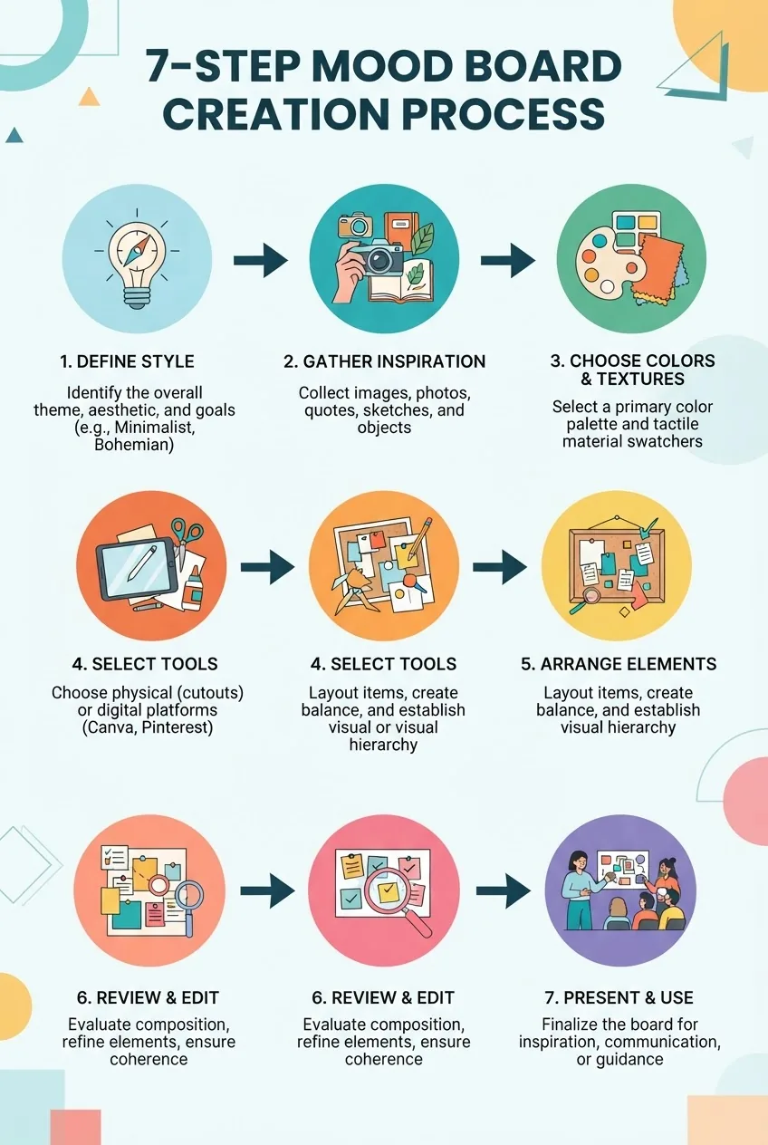
- Define the brief and constraints — Write a one-paragraph brief (max 60 words) listing room, function, budget range (e.g., $5,000–$8,000), and deadlines. Time: 15–30 minutes. This reduces indecision later.
- Gather inspiration — Spend 60–90 minutes collecting 30–40 images from magazines, Pinterest boards, supplier catalogs, and personal photos. Use tags: “lighting,” “sofa,” “rug,” “material.” Save at full resolution for digital boards. For DIY project guidance see room design DIY guide and tutorials.
- Choose a core color palette — Narrow to 3–5 hues by placing paint chips or swatches side-by-side. Capture a photo at noon light to ensure accurate color (use camera white-balance set to “daylight”). Label chips: primary, secondary, accent 1, accent 2. Keep the primary color covering ~50–60% of the visual weight.
- Select textures and patterns — For physical boards, pin 10–15 fabric swatches (20 x 20 cm) and 1 rug sample; for digital, include close-up texture photos at 100–200 dpi. Prioritize durability and maintenance notes (stain resistance, vacuum instructions). Make sure patterns follow scale rules: one large, one medium, one small.
- Pick furniture and lighting anchors — Add scaled images (with dimensions) of main pieces: sofa, table, lighting. If sourcing, list supplier and SKU. Always verify sofa depth vs. passage width: keep 60–90 cm circulation aisles.
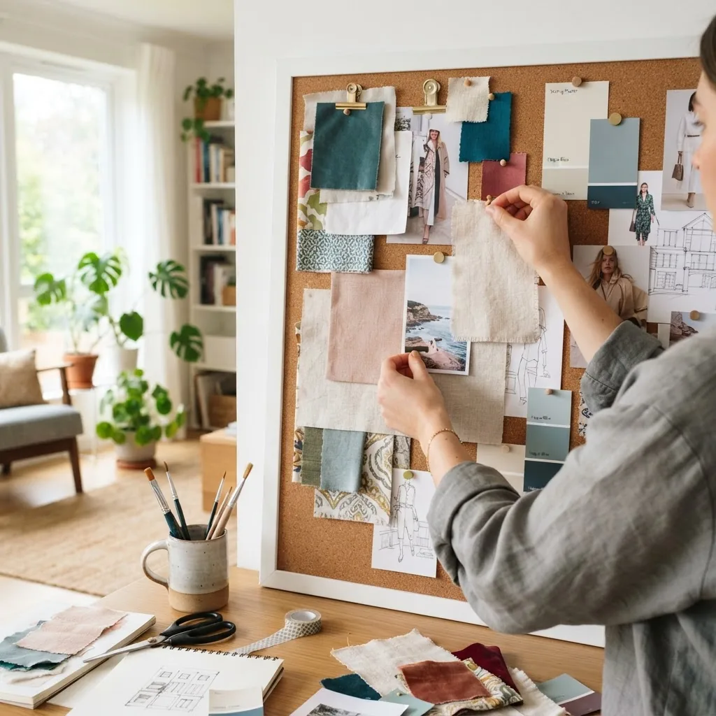
- Assemble in your chosen format — Digital: open a canvas sized 1920 x 1080 px (horizontal) or A3 if printing. Place elements using a loose grid: left column for background and large items, right for accents and spec notes. Physical: arrange items on your 60 x 90 cm board leaving a 5 cm margin.
- Establish visual hierarchy — Make the focal item roughly 40% larger in visual weight than supporting items. Define focal by size, contrast, or color pop. (Visual hierarchy = arrangement that guides the eye; put simply, the sequence you want viewers to notice elements.)
- Annotate and dimension — Add short labels (2–6 words) for each item: supplier, color code, dimensions, and price band. For digital boards embed links or thumbnails to product pages to make procurement faster.
- Review with a 15–minute critique — Step back (or zoom out to 25% in digital view) for 10–15 minutes. Ask: does the board read as one mood? Are there more than three dominant patterns? Remove or swap until the board reads cohesive.
- Export and prepare deliverables — Digital: export a 300 dpi PDF (for print) and a 72 dpi PNG for screen sharing. Physical: photograph the board under 4000K daylight at a 45° angle and include a scale ruler in the shot for accuracy.
- Present and use the board — Create a one-slide summary page with the core palette, focal image, and three procurement actions: order sample, confirm dimensions, finalise delivery date. Time for a client presentation: 10–15 minutes.
- Iterate — Keep the source files and create versioned filenames (e.g., LR_Mood_v01_2026-11-22). Revisit after 1 week for changes; major projects should revisit mood boards at major milestones (concept, procurement, pre-install).
Case study (hands-on walkthrough): I worked on a 12 m² guest bedroom with a $3,500 budget. Process: 1) brief (neutral calming retreat), 2) 45-minute image gathering, 3) palette selected (soft taupe, dusty blue, brass accent), 4) physical swatches pinned on a foamcore board, 5) one client review meeting where switching the rug pattern saved $300 and preserved the color harmony. The mood board reduced ordering errors and eliminated two costly returns.
Transition: now that you can build boards, choose the right digital tool or physical materials depending on your workflow and collaboration needs.
Best Tools and Software for Digital Mood Board Creation
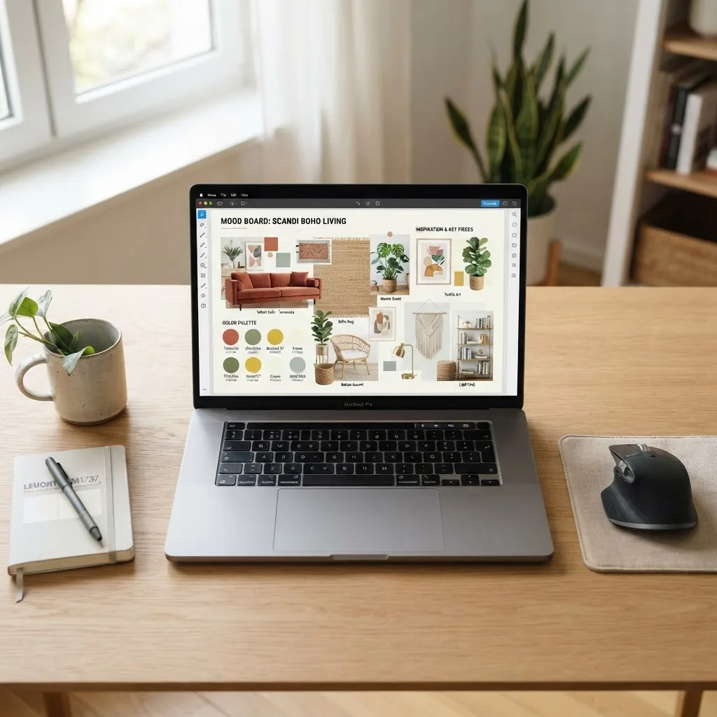
Digital tools speed iteration, scale sharing, and collaboration. Below is a practical comparison of popular options with typical use cases and trade-offs between ease-of-use, export quality, and collaboration features. For accurate color matching tools see colour match techniques and online tools. For matching palettes visually, consult color palette tools and guide.
| Tool | Best for | Pros | Cons | Use case |
|---|---|---|---|---|
| Canva | Fast layout and templates | Templates, drag-and-drop, team comments, PNG/PDF export | Color accuracy varies; image compression at default export | Quick client boards, presentations |
| Inspiration gathering and shared boards | Mass image sourcing, collaborative boards, visual search | Not layout-focused; requires export to design tool for final board | Idea collection phase | |
| Adobe Express (Spark) | High-res export and branded templates | Better color export control, integrates with Adobe ecosystem | Steeper learning curve for advanced features | Print-ready boards and branded client deliverables |
| Milanote | Designer-style visual notes and project boards | Flexible canvas, drag files, task lists | Free tier limited; print export less refined | Concept development and team collaboration |
| Moodboard-specific apps (e.g., Niice) | Curated mood board workflows | Built-in supplier links, palettes, asset libraries | Subscription costs; niche feature sets | Agency workflows and client deliverables |
Trade-offs: choose Canva or Adobe Express if you need ready-to-export PDFs; choose Pinterest for sourcing; choose Milanote for open-ended collaboration. External tool documentation can guide advanced color settings—see vendor sites above for latest features and export advice.
Transition: if you prefer tactile creation, the next section lists materials and construction techniques for physical boards and how to photograph them for accurate representation.
Physical Mood Board Creation: Materials and Techniques
Physical boards offer real texture, scale judgment and tactile testing; they remain indispensable for fabric-heavy projects. Recommended baseline materials: 60 x 90 cm white corkboard or 5 mm foamcore, 10–15 fabric swatches (20 x 20 cm), paint chips (6), printed images (10–12 on 200 gsm paper), double-sided tape, low-tack spray adhesive, labels, archival sleeves for loose samples.
Technique tips:
- Arrange large elements first: background photo, main rug, primary furniture image.
- Layer textures so tactile pieces slightly overlap by 2–3 cm to read as one space.
- Use fabric swatches on card stock for durability and annotate with supplier and care instructions.
- Attach paint chips in the lower-right corner and photograph under neutral light for sharing.
For paint sample selection and accurate chip usage see paint colours guide and chart. Photograph physical boards at 1.5–3 m distance under 4000K lighting, use RAW or highest-quality JPEG, and include a neutral gray card for white balance correction.
Checklist for your physical board:
- Board size: 60 x 90 cm (or A1 for larger projects).
- Fabric swatches: 10–15, 20 x 20 cm each.
- Paint chips: minimum 3, maximum 6 per scheme.
- Prints: 10–12 images on 200 gsm stock.
- Labels: supplier, SKU, dimension, price band.
Transition: the next section gives creative styling techniques that lift a mood board from functional to compelling.
Creative Styling Tips to Elevate Your Mood Board
Styling is where the board communicates an emotional intent. Use layering, contrast, and a defined focal point to guide the viewer’s eye. Define visual hierarchy early: label the sequence you want viewers to notice and adjust size and contrast accordingly. (Definition: visual hierarchy is the arrangement of elements to indicate order of importance.)
Practical techniques:
- Layering: place texture samples so lighter textures sit on top of dark backgrounds to increase legibility.
- Contrast: use one high-contrast accent (e.g., matte black light against pale walls) to create focus—limit to one or two accents.
- Balance: mirror visual weight left-to-right; if the focal sofa is on the left, add a tall lamp on the right to balance height.
- Scale checks: include one measured item to prevent scale illusions (e.g., sofa footprints vs rug size).
When selecting colors, practical pairing rules help: pick a dominant neutral, add a mid-tone, then a saturated accent. For deeper pairing strategies, see best colour combos guide for interior decorating and consider training on shades via colour shade guide and training. For scientific background on color and mood, see Frontiers in Psychology: color-emotion research.
Trade-offs: digital boards make editing and sharing easy; physical boards provide tactile insight. Use both when possible—start physical for texture-heavy projects and digitise for client review.
Transition: below are common mistakes I see in practice and exact ways I fix them.
Common Mistakes in Mood Board Creation and How to Avoid Them
- Cluttered boards: I once received a board with 40 images; we reduced to 12 and added labels—result: clearer decision-making.
- Inconsistent styles: Mixing modern minimal and rustic farmhouse without a unifying element—pick one thread (material or color) to link them.
- Ignoring scale: An overlarge rug photo misled the client; always add dimensions or scaled furniture footprints.
- Poor color choices: Rely on physical samples or calibrated screens; if unsure, add a gray card photo for reference.
- Incomplete themes: Missing lighting or textiles leads to late-stage changes—include lighting and at least one textile sample early.
Transition: mood boards are also powerful communication tools for client and supplier collaboration; the next section explains how to use them in those scenarios.
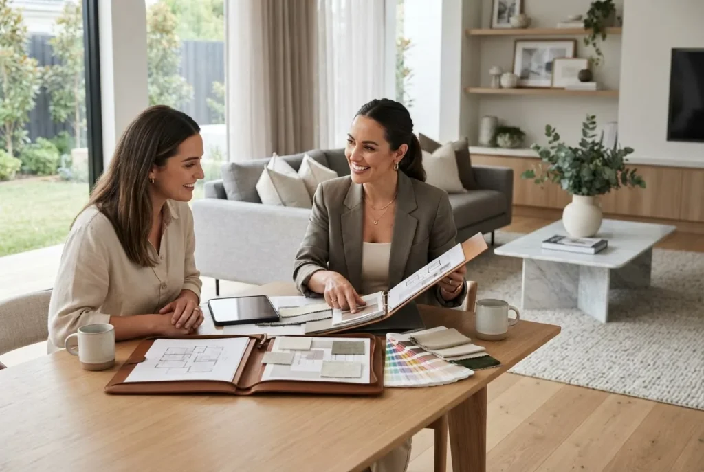
Using Mood Boards to Communicate with Clients and Suppliers
Mood boards translate subjective taste into objective decisions. In client presentations, use a three-part structure: 1) one-sentence design brief, 2) the board (core palette and focal image), 3) three recommended next steps (samples to order, items to confirm, budget adjustments). Limit the presentation to 10–15 minutes with 5 minutes for client feedback.
Practical scenarios:
- Client approvals: share a 1-page PDF with annotated items and supplier links so clients can approve by checkbox.
- Supplier coordination: include SKU numbers and delivery windows on the board to avoid mismatches.
- Feedback loops: use collaborative tools (Canva comments or Milanote) to capture changes and version history.
For broader styling best practice and client presentation strategies, see interior styling tips guide for effective home decoration.
Transition: finally, keep boards organised and up-to-date with simple version control and storage habits described below.
Keeping Your Mood Boards Organized and Updated Over Time
Best practices:
- Digital storage: create a project folder with subfolders /assets, /final, /versions. Use filenames like LR_Mood_v02_2026-11-22.jpg.
- Version control: keep a changelog.txt that lists edits, who approved them, and dates.
- Archiving: move completed projects to an /archive folder after 90 days to keep active workspace lean.
- Iterative design: schedule review checkpoints at concept, procurement, and pre-install.
- Project management: link your key board to tasks in your PM tool (Asana, Trello) for procurement follow-up.
Software and tool updates happen frequently—record the tool version and export settings you used (e.g., Canva export: PNG 72 dpi and PDF print 300 dpi) so collaborators can reproduce results.
Common mistakes and how to avoid them (practitioner notes)
From my experience: I once left fabric care off a board and the homeowner bought an unsuitable sofa. Now I always include care and weight notes. Another time I relied on uncalibrated screen images and the rugs arrived darker than expected—now I photograph paint chips with a gray card and flag lighting temperature on every board.
Compact verification checklist
- Core palette labelled (primary, secondary, accents)?
- Textures: at least one large, one medium, one small?
- Focal element clearly defined and visually dominant?
- Dimensions and supplier SKUs included?
- Exported PDF + low-res image for sharing?
- Versioned filename and changelog created?
When to call in a professional
Call a professional when: the project budget exceeds $25,000, you need structural layout changes, electrical planning for lighting is required, or you require architect-level compliance. For formal courses that expand these capabilities see residential interior design course and certification.
Final note on standards and frameworks: when referencing professional standards, consider industry guidelines such as those from the International Interior Design Association (IIDA) for process frameworks. For official guidance see IIDA.
Summary: a repeatable mood board workflow reduces risk, enables clearer client communication, and speeds procurement. Use physical samples where texture matters and digital boards for collaboration. Start with a 7-step process, stick to the checklist, and update versions at milestones.
Ready to start? Gather your brief, choose one tool (Canva or a corkboard), and allow 3–6 hours to produce a client-ready board. Want training? The course Interior Design Styles Course for New Home Styling Professionals is a practical next step.